Font Hinting
![]() font hinting
font hinting
![]() ?
?
![]() ?
?
Examples of hinting
Antialiasing
Sources
Links
Hinting provides information to the raster image processor (RIP) for rasterisation of fonts. Low resolutions or small font sizes may otherwise present the glyph (shape of character) with various distortions:
- Stem widths are unequal
- Line thicknesses are unequal
- Location of features are inaccurate
The method of hinting depends on the font type. TrueType and PostScript fonts use different methods. For Type1 fonts (PostScript fonts) only hints for vertical and horizontal stems are defined. For TrueTrype a 'hinting language' allows for very detailed control of the raster process. Modern type creation tools (Fontographer, FontLab) support both types of hinting in an intuitive way.
Previous methods
Before hinting was available in the tools used for creating fonts and in the rasterisers a set of bitmaps was necessary for screen display of a particular font.
![[To top/bottom of page]](../../z_designs/nav-dnup.gif) Examples of hinting
Examples of hinting
| Glyph rasterised without hints | Glyph rasterised with hints |
|---|---|
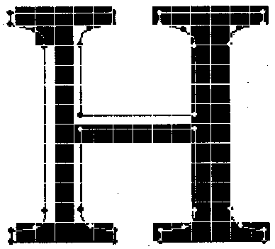 |
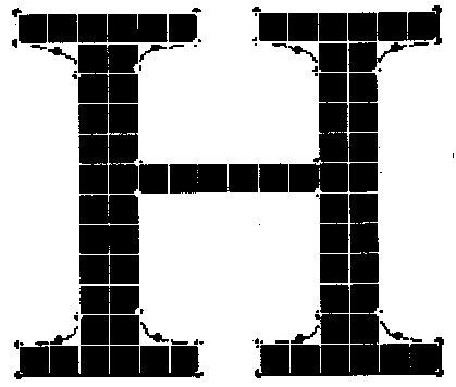 |
The effect of hinting can best be seen in a series of glyphs rasterised in various sizes.
| Rasterised without hinting | 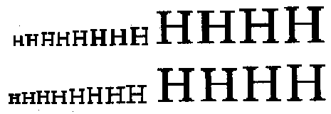 |
| Rasterised with hinting |
Antialiasing
Even for display on screens the hinting information became less important with the introduction of antialiased glyphs. This method adds additional shaded (not just black and white) pixels to the edges of the shapes which blurres the image. Our brain recognises a more smooth contour.
On Windows the Adobe Type Manager first allowed to use antialiased glyphs. With the later Windows version (starting with NT) the antialiasing was implemented into the operating system.
Sources
U&LC (Upper and Lower Case) see www.ict.com and various other
Further links