Legibility
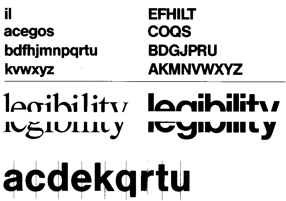
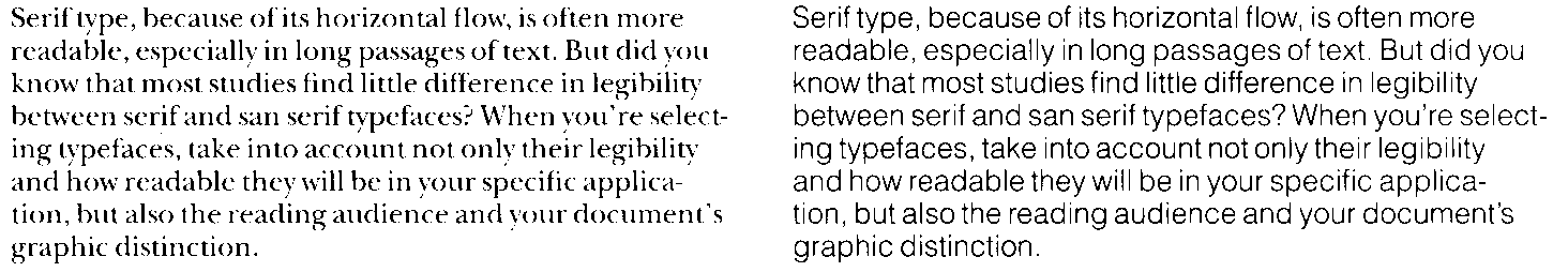
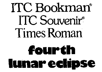
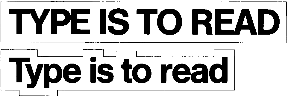
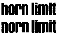
Type is legible if the glyph and word shapes are easily recognised ...
1 |
legibility; legible |
leserlichkeit, die; leserlich |
|
2 |
glyph | zeichenform, die | |
3 |
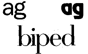
serif type | serifen schrift, die | |
4 |
sans serif | serifenlose schrift, die | |
5 |
word contour | wortkontur | |
6 |
x-height | minuskel-höhe, x-höhe | |
7 |
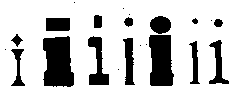
font weight | fette, die | |
8 |
font hight | versalhöhe |
legibility-badtypo.png
legibility-good.png
legibility-heavystrokes.png
legibility-lettershapes.png
legibility-limited.png
legibility-restrictions.png
legibility-serif&sans.png
legibility-serifs.png
legibility-weight.png
legibility-wordshapes.png
legibility-xhightexcessive.png
legibility-xhightlarge.png

![[To top/bottom of page]](../../z_designs/nav-dnup.gif) Sources
Sources
Swiss publication Produktion+Print, Nr. 10, Oktober 1996. Definitions according to Duden / Wahrig / Langenscheidt.
Further links