Microtypography
A number of techniques for finetuning the appearance of text are described under the heading of microtypography. Only few DTP programs observe these rules which evolved from the centuries of dealing with type from the time of Gutenbert to the computer age.
As with most crafts the knowledge of these challenges for the skilled eye gets lost in the computer age, because «beauty is in the eye of the beholder» and most DTP people do not have the background of an old-style typographer.
1 |
kerning (n.) letter fitting |
unterschnitt, der |
|
2 |
microtypography | mikrotypographie, die; feintypografie, die | |
3 |
letter spacing | zeichenabstand, der | |
4 |
word spacing | wortabstand, der | |
5 |
optical adjustment | optischer ausgleich, der | |
6 |
line spacing | zeilenabstand, der | |
7 |
leading | durchschuss, der |
Letter spacing
The goal is to have a uniform typographic colour. If you squint while looking at a block of text, it should be an even tone of gray. If too-tight letterspacing causes dark spots to appear where letters are too close or touch, readability will suffer. Sans-serif fonts are more aken to this effect (willibald vs willibald).
Kerning
Not all letters combine as well as others. Sometimes they produce uneven or too-loose spacing when set under normal conditions. Good font design provides kerning values for a range of type sizes of a particular font. However, these mechanisms do not create sufficient results in all cases. For large type sizes, mixed fonts or font variations manual adjustment of the glyph-locations are necessary. These situations are not common to ordinary text, but to logo design, headlines etc.
| Standard kerning as provided by font metrics | Manual kerning for a pleasing appearance |
|---|---|
| M & Z soll mir da ein beispiel schicken | M & Z soll mir da ein beispiel schicken |
Optically adjusted text
| optically adjusted text (right) | |
|---|---|
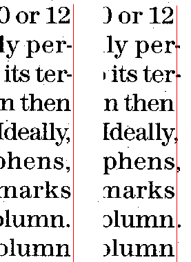
Glyph shapes on the margin should be optically adjusted. That is, the shape of the first or last glyph in the line determines a slight overhang over the imaginary left or right margin line: Right adjusted textPunctuation (periods, hyphens, commas, apostrophs and quotation marks) should fall outside the rigth edge of the column. Left adjusted textList marks, for example, the n-dash should fall o utside the left edge of the column. Large round shapes also overrun the margin line as do shapes with horizontaly extending features, such as a sans-serif T.
|
 |
Since these rules can not be implemented in the font metrics (they have nothing to do with kerning) DTP program must allow for individual horizontal adjustment beyond the margin – and only very few program provide this feature.
Word spacing
Word spacing should be even. Condensed typefaces, typefaces with a small x-hight, and sans serif typefaces all require that word spacing be tight as well as optically even. The most efficient reading is though the process of seeing three or four words at a single glance. Sometimes this process should be aided by reducing normal word space values slightly. The normal word space is the inner width on an "n" chacracter.
Line spacing
At text sizes (about 7 to 14pt) mechanical line space values (120% of the hight of the "H") are fine for optical correctness. But for larger sizes, capital letters as well as sascending and descending letter parts will have some effect of the readers perception of linespacing. Very often, lines of display type need to be adjusted from mechanical accuracy to optical correctness (e.g. from 19mm line distance to 20mm).
Line spacing must be larger than the common value of 120% for text with accented characters. Even more line space is needed for text with footnote reference. It would be very bad looking if only the lines containing a footnote reference would have a larger distance to the top line...
![[To top/bottom of page]](../../z_designs/nav-dnup.gif) Sources
Sources
U&lc (upper and lowercase) by www.itcfonts.com, a printed publication around 1990.
![[To top/bottom of page]](../../z_designs/nav-dnup.gif) Further links
Further links