Schmitz
![]() ???
???
![]() Schmitz [n, masc.]
Schmitz [n, masc.]
![]() ???
???
In the time of the hot metal press the printed image became final only on the paper.
Under heavy pressure of the printing press in book printing the ink was squeezed out between the metal type and the paper. This created a larger image on paper than the original metal type. The amount of "overprint" was called "schmitz" in German speaking areas.
This had a nice side effect: smaller type was enlarged by a larger proportion than larger type. It also reduced the contrast of roman script type. This side effect created a better appearance of small type during the time of hot metal typing.
In digital typography this effect does not exist. To get a slightly bolder appearance of small type (optically pleasing), the font outlines should be enhanced: adding a seam around the contour.
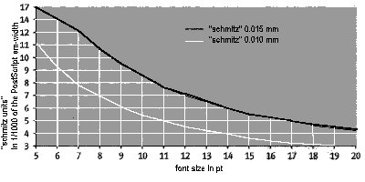 Black line: "schmitz" 0.015 mm
White line: "schmitz" 0.010 mm
 With
PostScript fonts this effect could be created by superimposing the normal outline glyph with a countour of a defined line width.
I do not know whether this could also be achieved by font hinting.
With
PostScript fonts this effect could be created by superimposing the normal outline glyph with a countour of a defined line width.
I do not know whether this could also be achieved by font hinting.
![[To top/bottom of page]](../../z_designs/nav-dnup.gif) Sources
Sources
Karl-Christian Lege and Gerd Gruhl in Page 5/1994 [...]
Further links